Are traffic signs the same all over the world? Although there are small differences, the shapes, colors, and symbols are similar enough for communication.
No matter what country you’re in or the language you speak, it’s critical to be able to interpret road signs immediately. There’s no time for confusion when you’re driving at high speeds. So, are traffic signs the same all over the world? Not completely—but they’re close enough to get the message across.
The Standards for Signs
The MUTCD
In the United States and Canada, the Manual on Universal Traffic Control Devices dictates what signs look like. Some rules are common sense, such as the color red is associated with danger. However, the biggest improvement to road sign design occurred in the ’40s when engineers were able to create sign sheeting bright enough to be seen at night.
Mississippi’s Shapes
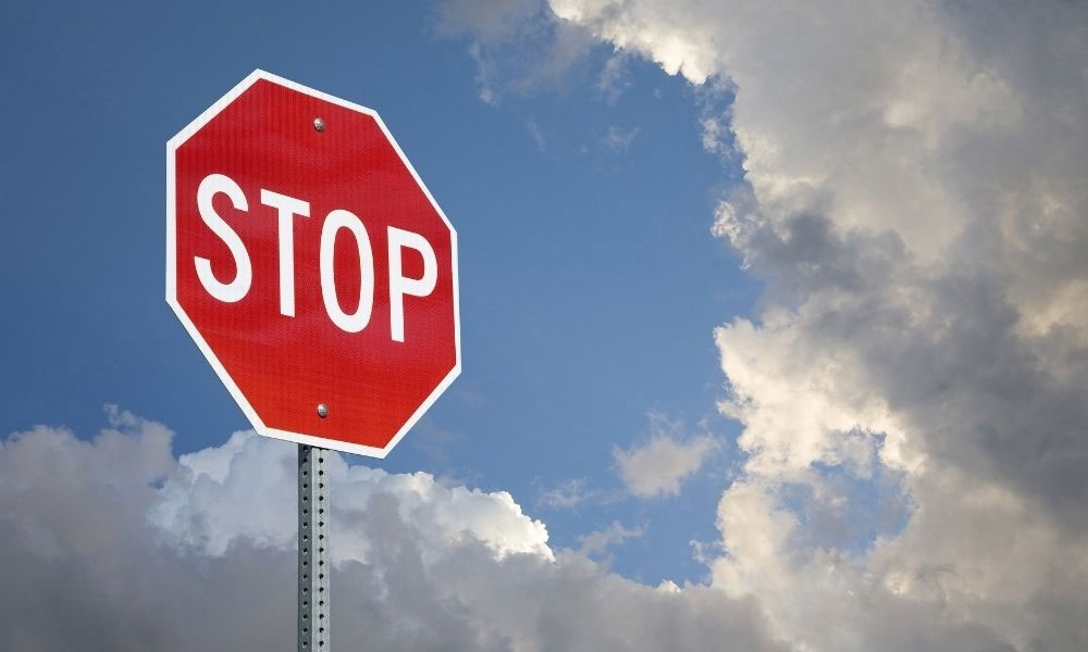
Other rules have their own logic. In 1923, the Mississippi Valley Association of State Highway Departments recommended shapes according to a system: the more sides a sign has, the higher the danger. So, an octagon with eight sides was assigned to stop signs, while a circle—with an infinite number of sides—was reserved for railroad crossings.
The Vienna Convention
In 1968, 62 countries came together for the Vienna Convention on Road Signs and Signals and agreed on a system for color, shape, and other iconography. They settled on a triangle for most warnings.
The Font
Through trial and error, in 1948, the U.S. Federal Highway Authority concluded that the sans serif “Highway Gothic” alphabet was the most legible for reading from a distance and at high speeds. At first, it only included capital letters, but in 2000, lowercase letters were added. Almost all signs across the globe use a slight variation on the font.
The Differences in Signs
The Metric System
Some countries show speed limit warnings in miles, while the rest use the metric system. British Columbia, Canada, solved the problem for incoming American drivers with signs that say, “60 mph is 100 km/h.” No one thinks it’s a good idea to be doing math while driving.
Native Wildlife
You might have gotten used to slowing down for “deer crossing” signs, but it’s always startling to see warnings in other countries for kangaroos, beavers, and more. A few examples include:
- Sweden: Elk
- New Zealand: Kiwis
- United Kingdom: Hedgehogs
- Africa: Oryx (a type of antelope)
- Japan: Crabs
- Bolivia: Llamas
- Greenland: Sleds (not animals, but dangerous nonetheless)
Stick Figures
The symbols for people are fairly universal, with just a few discrepancies across the globe. In Israel and Japan, the “pedestrians crossing” are wearing hats. In Australia, only the legs are shown. And in Laos, the person in the crosswalk is a female in a long skirt and hair up in a bun.
Are traffic signs the same all over the world? It’s an impressive achievement that we’ve all come up with a nearly universal “sign” language—and it’s saved countless lives on international roads. At Custom Products Corporation, we can help you with signage that adheres to the MUTCD’s regulations or any custom safety signs you need. Contact us for more information.


